Teaberry Fields & Forest
Teaberry Fields & Forest
Teaberry Fields & Forest is a 300-acre Regenerative Organic Certified farm nestled in Pennsylvania’s Pocono Mountains, founded on the essential belief in regeneration. As a long-term partner, Brandettes leads the farm’s brand identity, creative direction, marketing, and ecommerce efforts, while also driving product innovation and packaging initiatives that bring Teaberry’s regenerative vision to life.
Brand: Teaberry Field & Forest
Agency: Brandettes
Industry: Agriculature
Services: Art Direction, Identity Design
Awards: GD USA Health & Wellness 2026 Award WInner
Logo Refresh
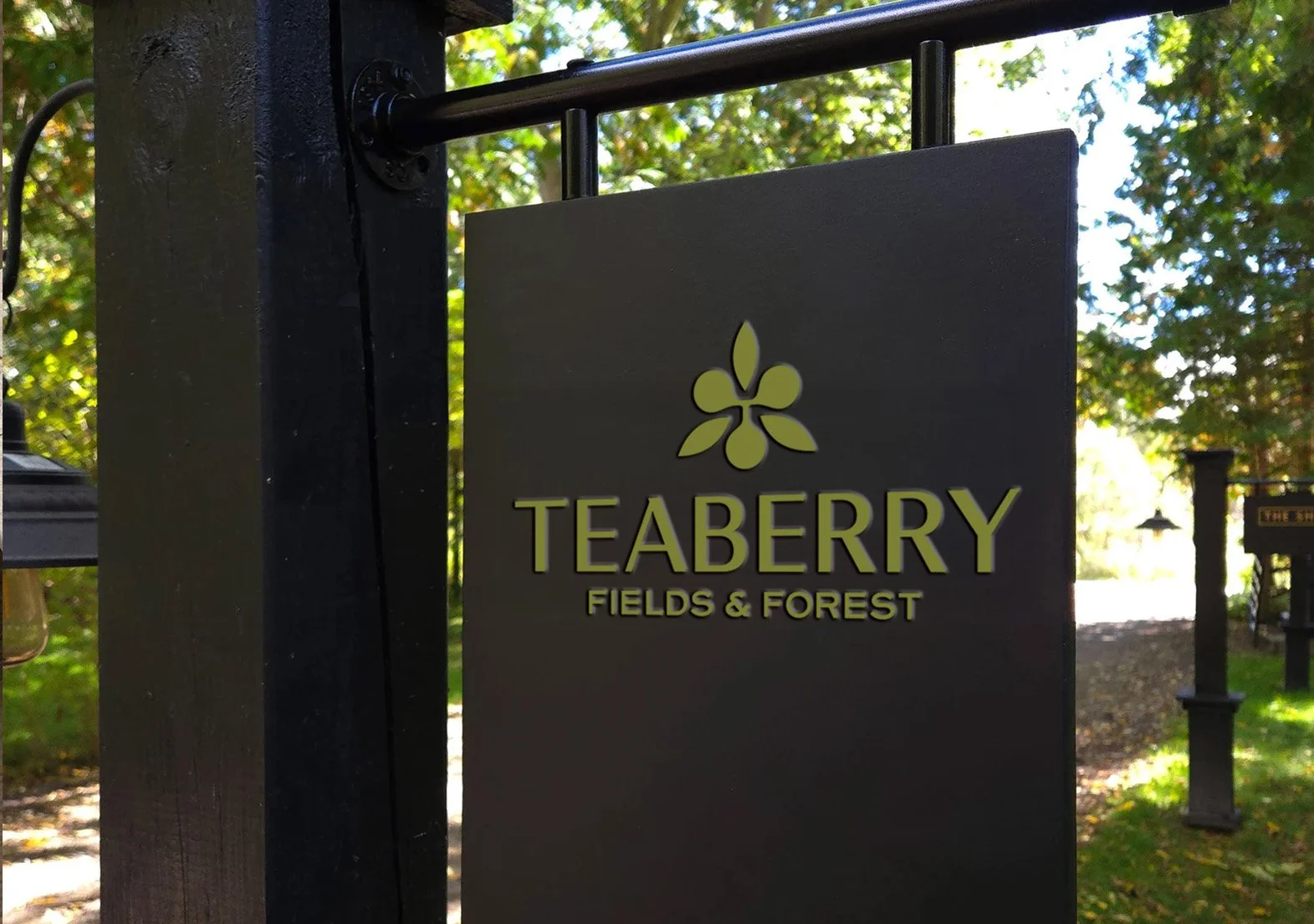
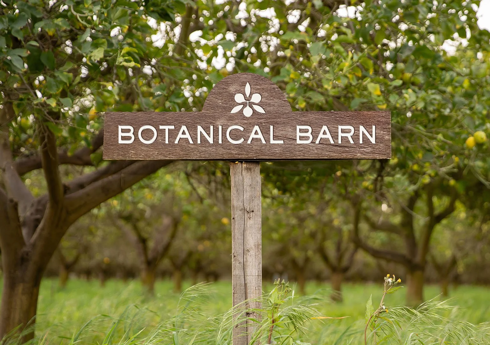
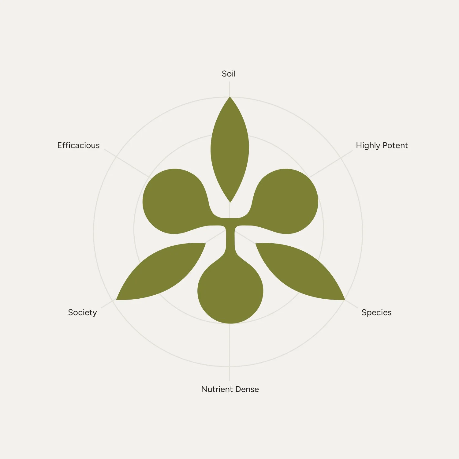
The Teaberry logo is a distinctive emblem designed for instant recognition, rooted in growth, vitality, and balance. Six organic flourishes represent the farm’s foundations: three leaves for soil, species, and society, and three berries for potency, efficacy, and integrity. Together, they symbolize Teaberry’s purpose: stewardship, regeneration, and lasting value.
Brand Identity Guidelines
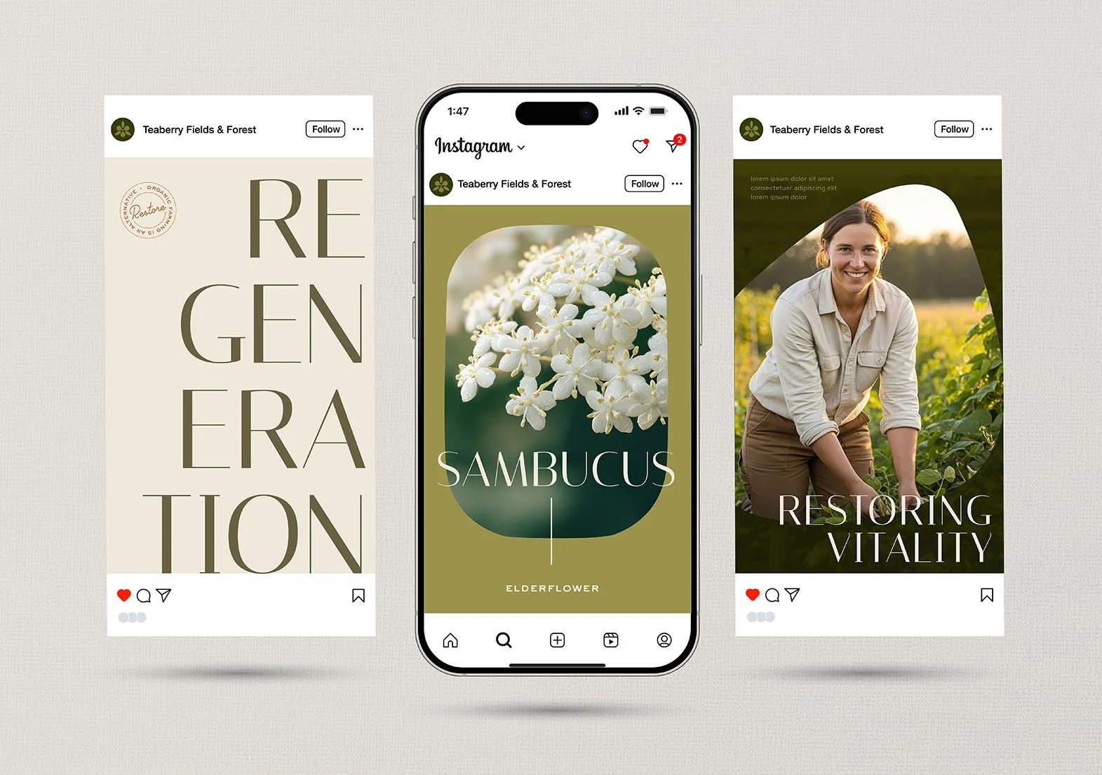
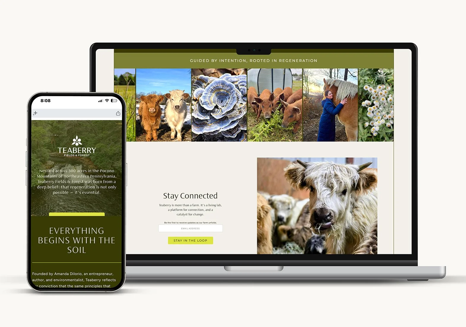
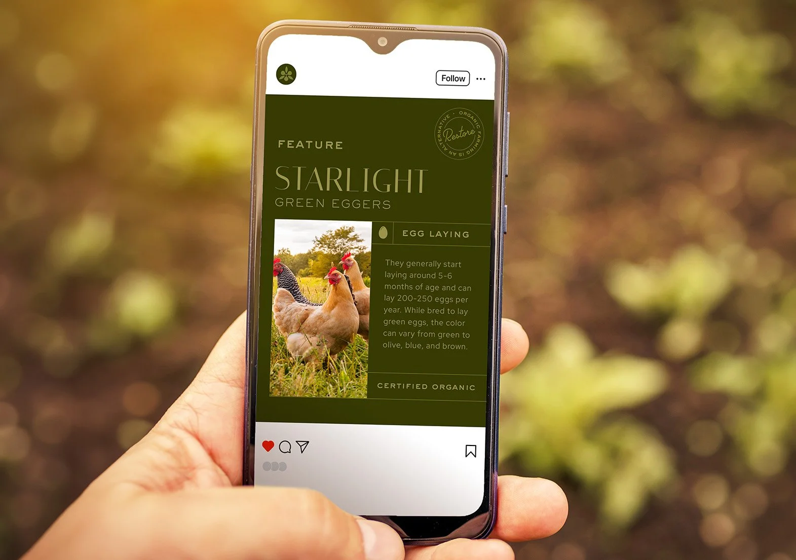
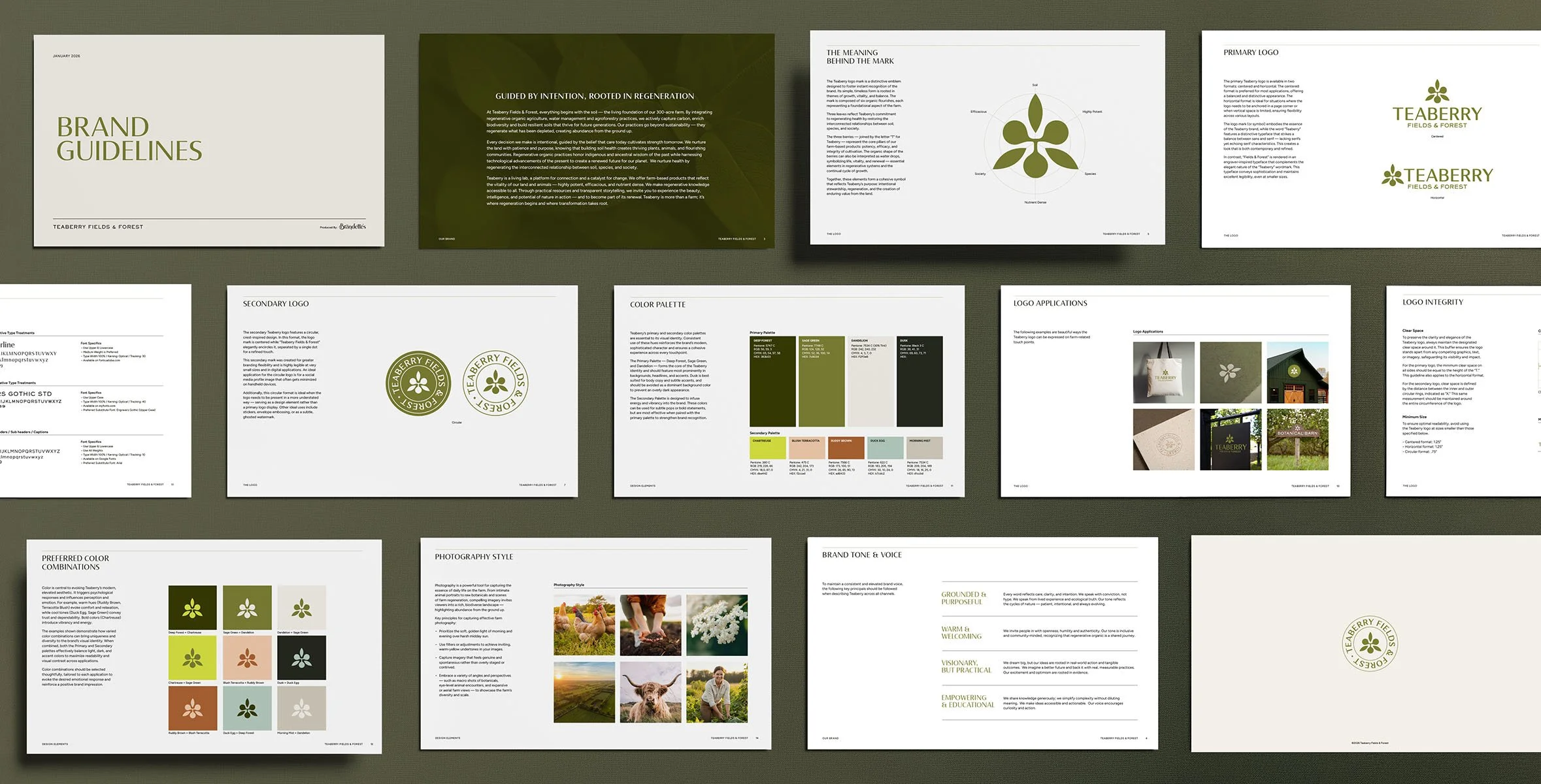
To launch the brand’s initial phase, we developed comprehensive guidelines covering logo usage, color palette, typography, and imagery style. Creative examples across multiple touchpoints to envision the brand's future potential.
Color Combinations
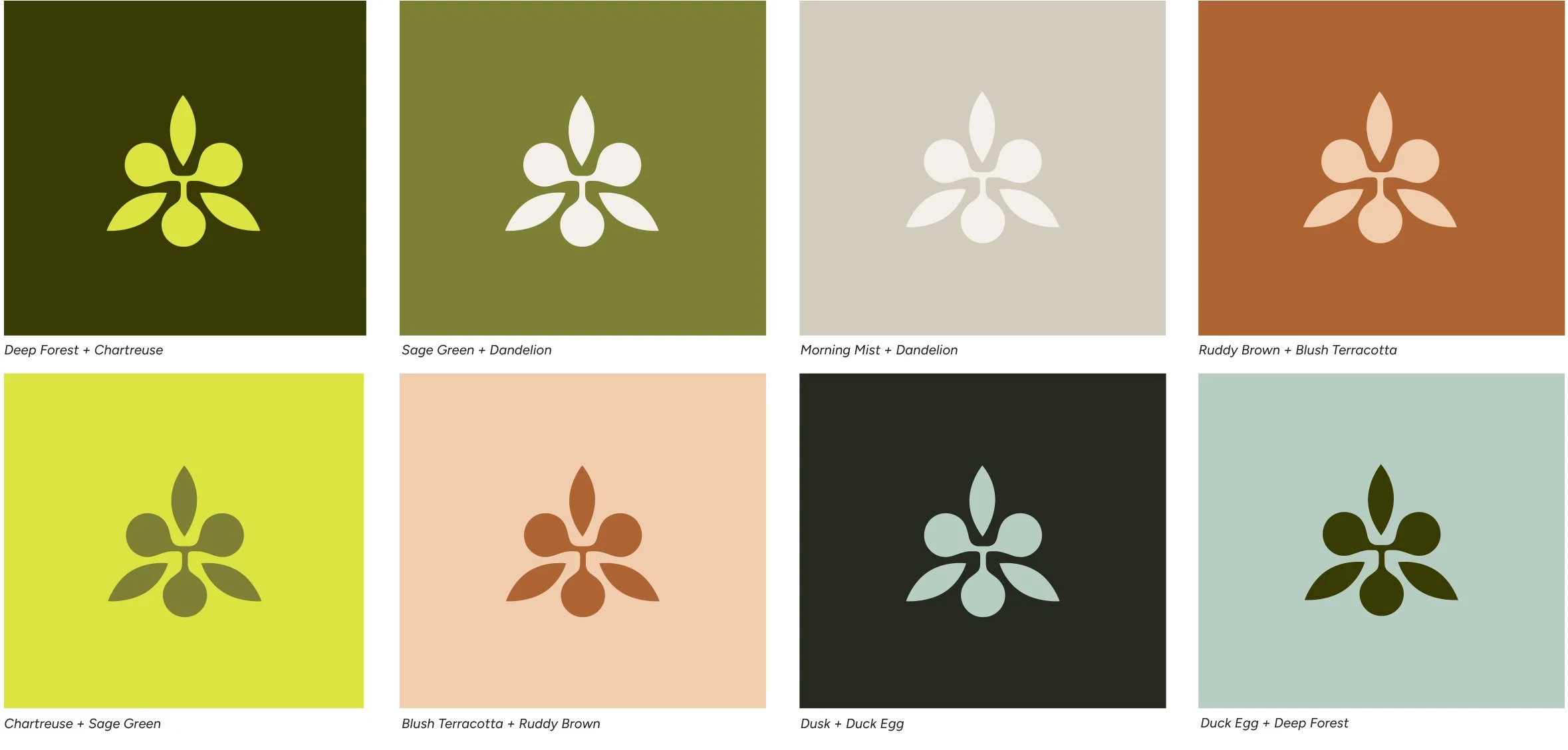
We created a primary & secondary brand palette. The Primary Palette — Deep Forest, Sage Green, and Dandelion — forms the core of the Teaberry identity and is reflective of the farm's terrain. The Secondary Palette is designed to infuse energy and vibrancy into the brand. Below are color combinations that combine both palettes to show the palette's range and versatility.
Creative Applications